Graphic Design & Video Editing
Every project begins with a vision. This collection features commissioned work including wine labels, branding, marketing campaigns, infographics, promotional videos, and film artwork created for both small businesses and larger organizations. I love collaborating with clients to turn their ideas into meaningful visual stories that connect with audiences, strengthen brands, and bring creative concepts to life.
JAMIE’S BOTTLE SHOP
Located in Scottsdale, AZ
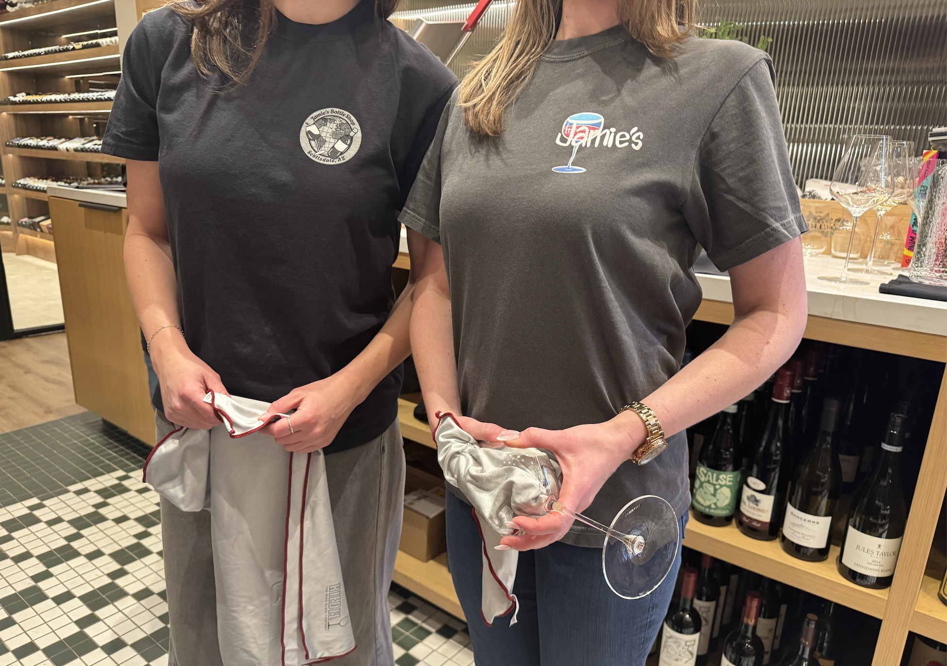
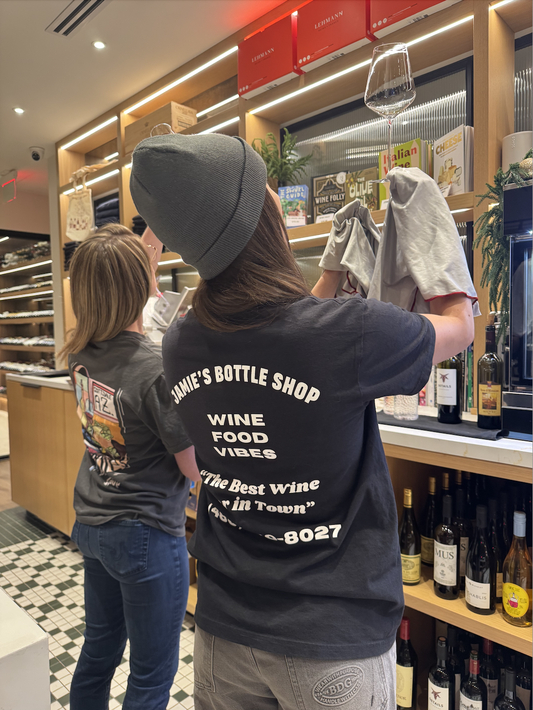
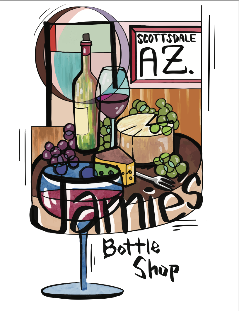
Problem: In a competitive retail environment, Jamie's Bottle Shop needed a way to stand out, create memorable customer experiences, and turn customers into brand advocates.
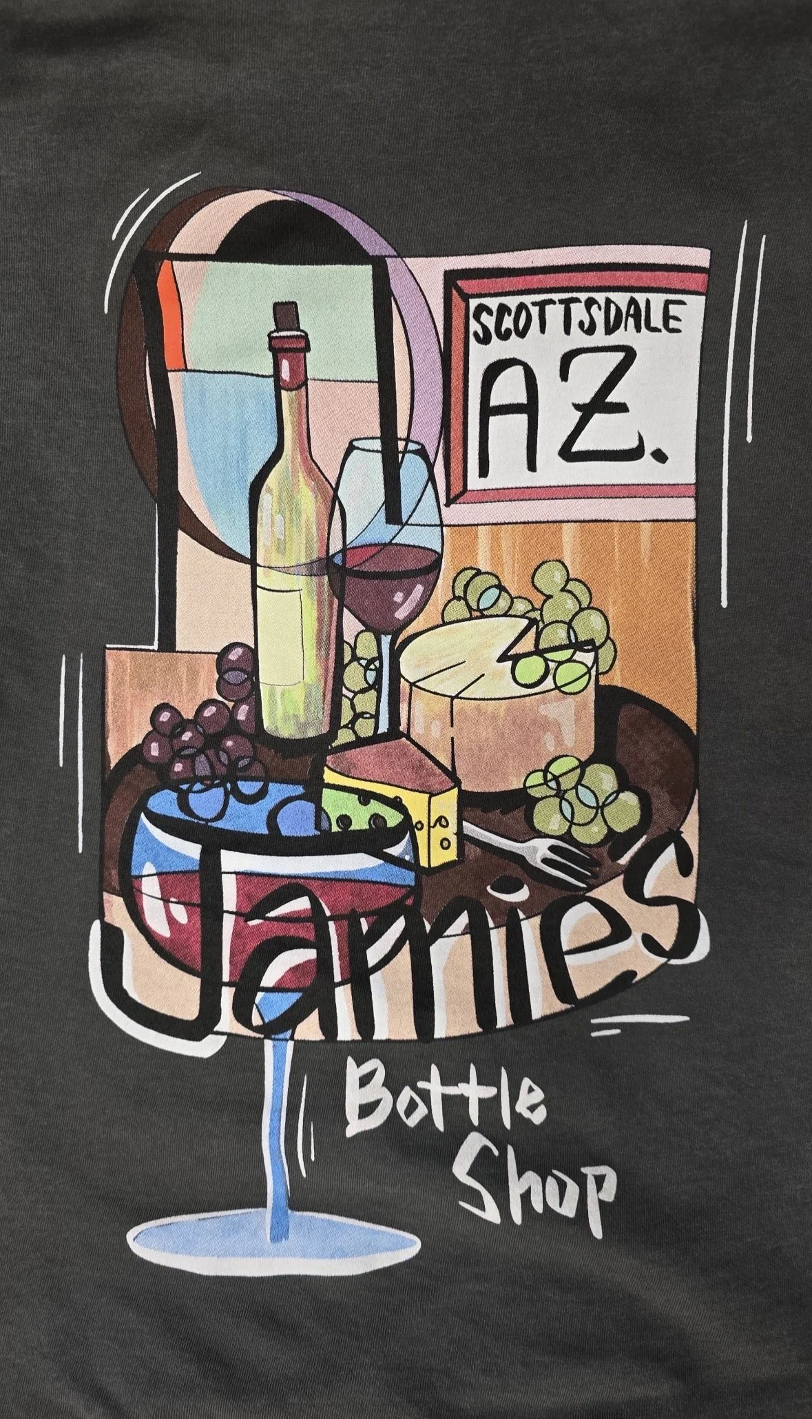
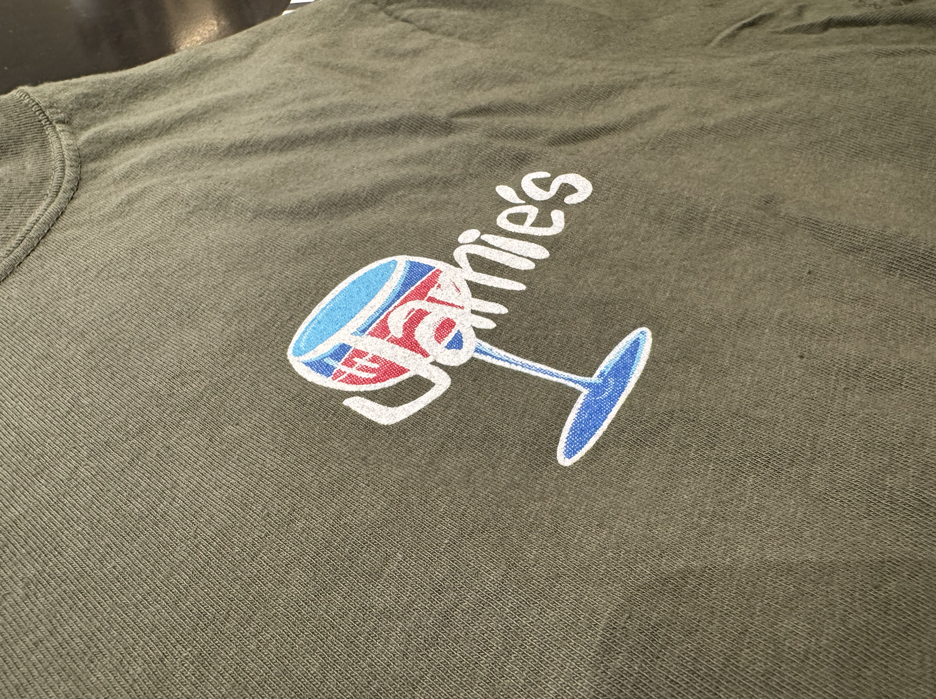
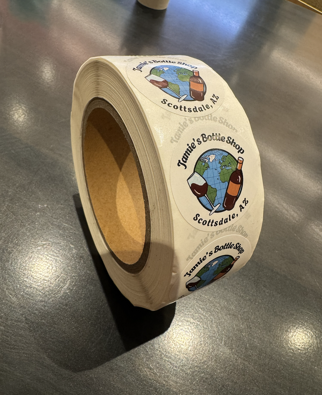
Solution: I designed a custom merchandise line featuring original artwork applied to employee uniforms, retail apparel, stickers, and tote bags. By creating products customers genuinely want to wear and use, the merchandise extends brand recognition beyond the storefront and helps build a stronger, more recognizable community around the business.
PEACHFORK ORCHARD AND VINEYARD
Located in Palisade, CO
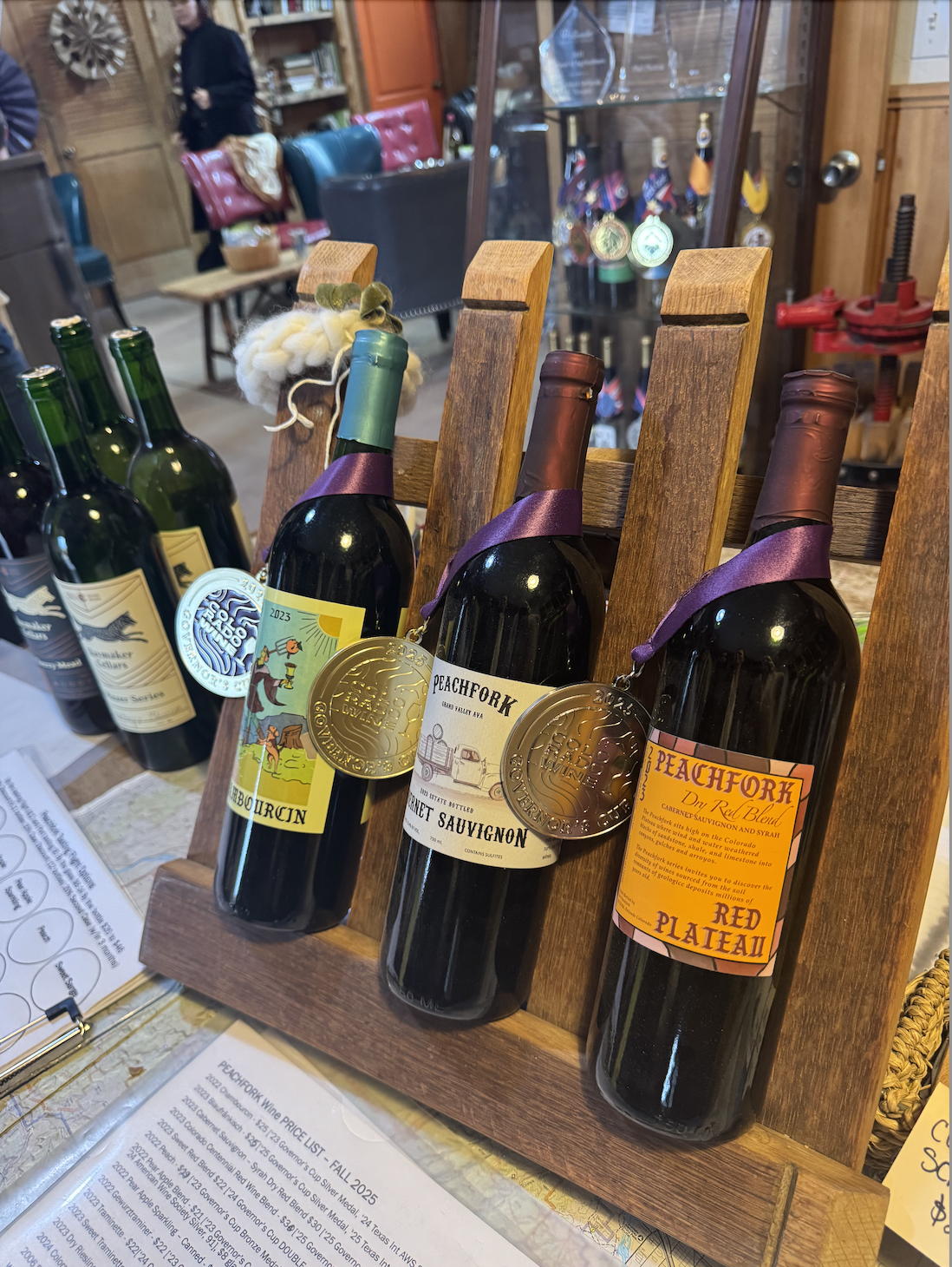
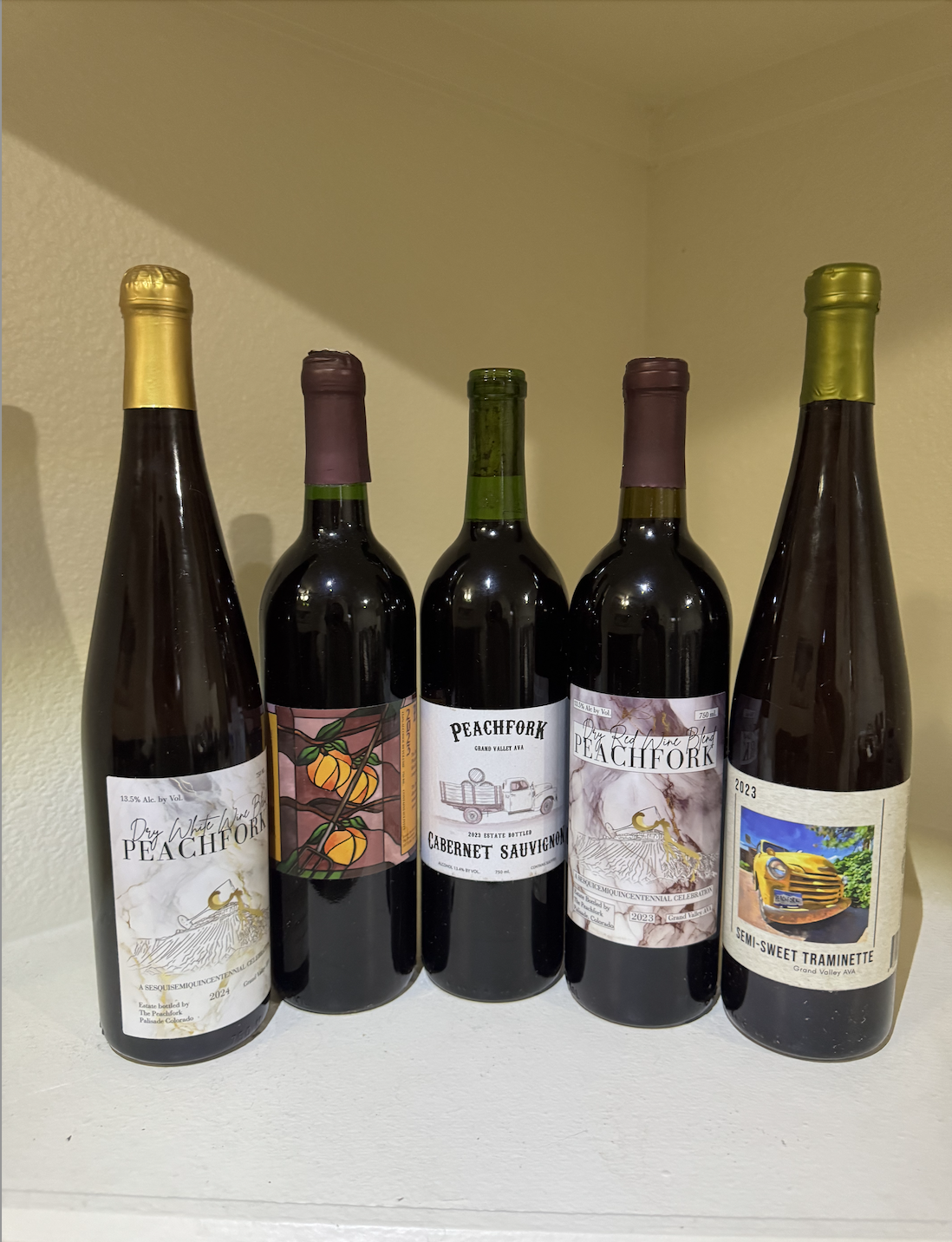
Problem: Peachfork Orchard & Vineyard needed wine labels that would stand out on the shelf while authentically representing the values and story behind the brand. The challenge was creating packaging that felt personal, memorable, and reflective of the family's deep connection to their vineyard.
Solution: After visiting Peachfork and spending time learning about the vineyard, I discovered the true essence of the brand: a multi-generational family business built on tradition, passion, and the love poured into every bottle. Inspired by their story, I created a series of custom wine labels designed to communicate that warmth and authenticity to customers. Through thoughtful illustration and visual storytelling, each label serves as an extension of the family's legacy, inviting consumers to connect with the people, history, and craftsmanship behind the wine before they ever take their first sip.


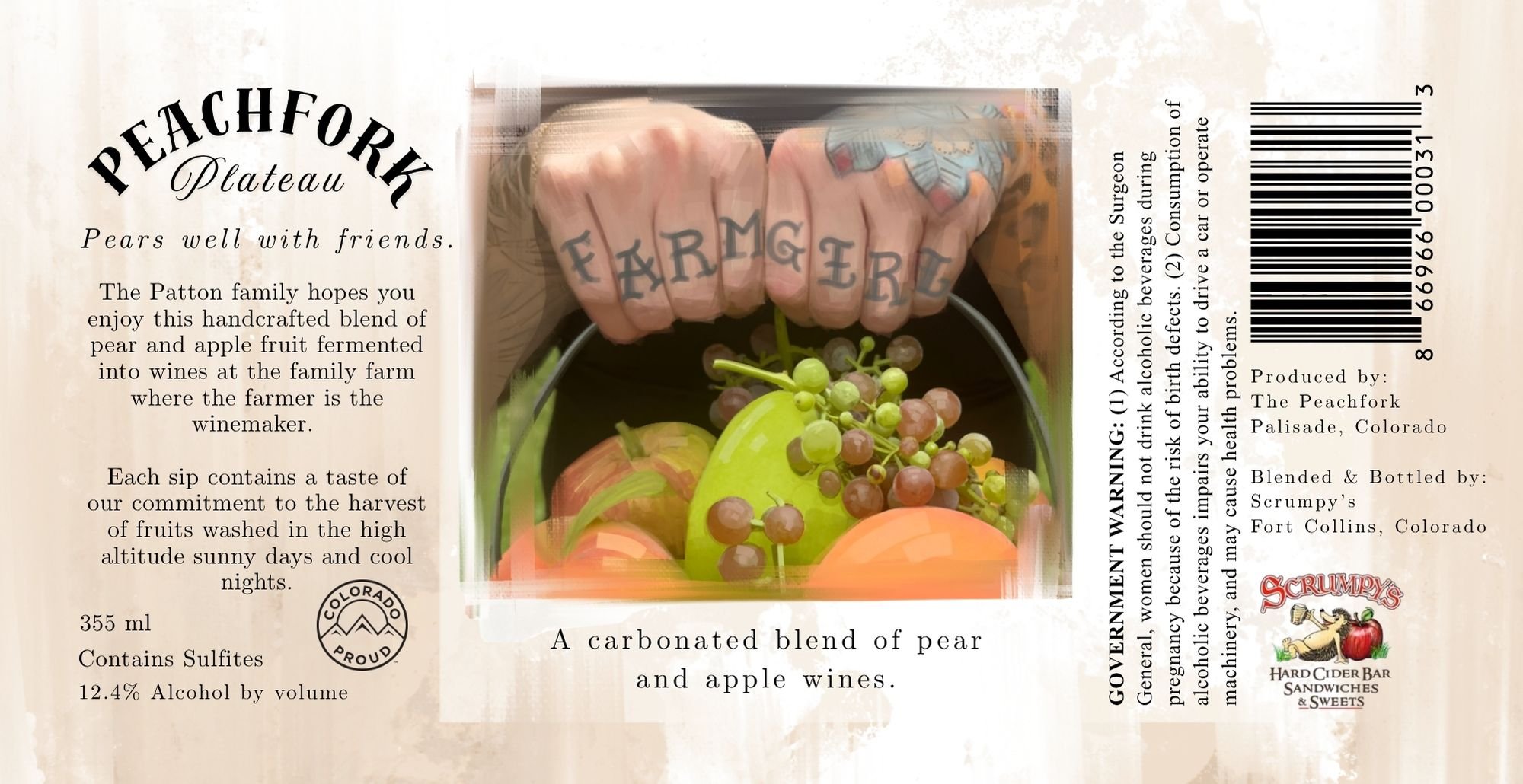

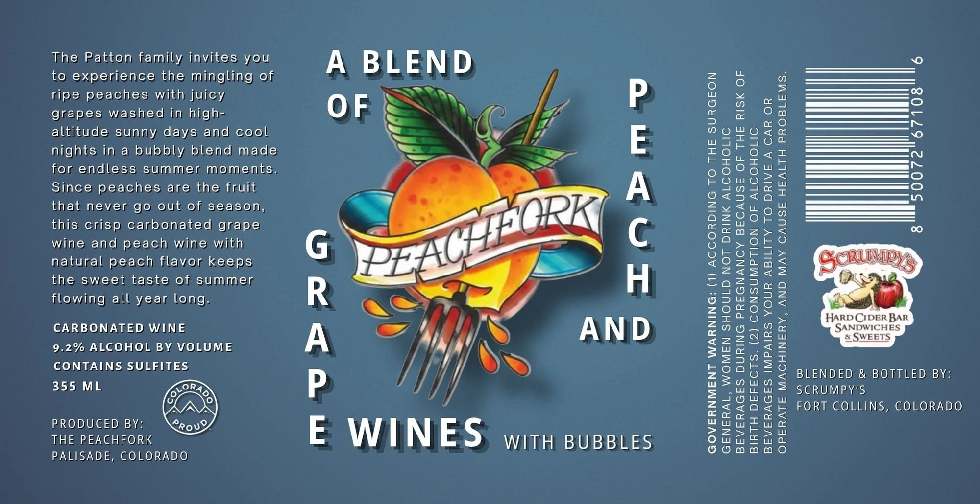
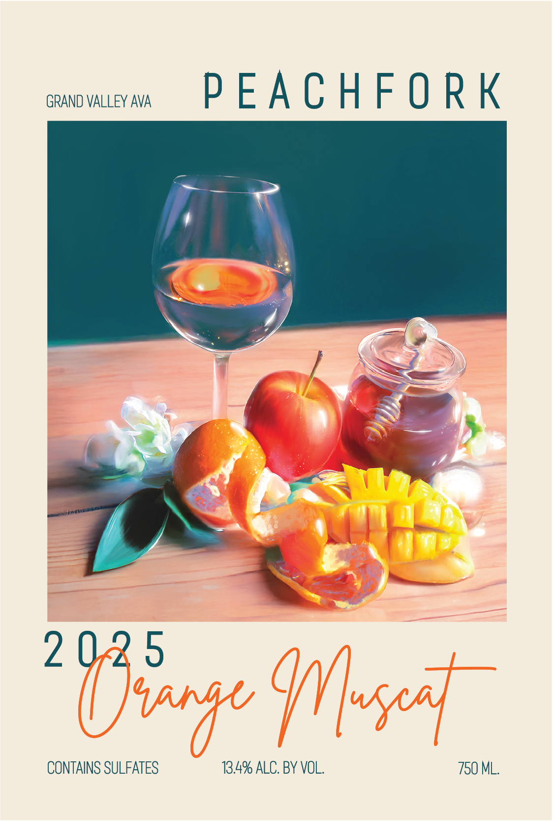
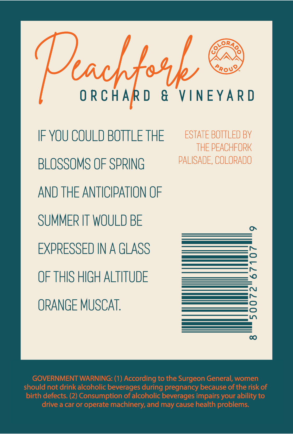
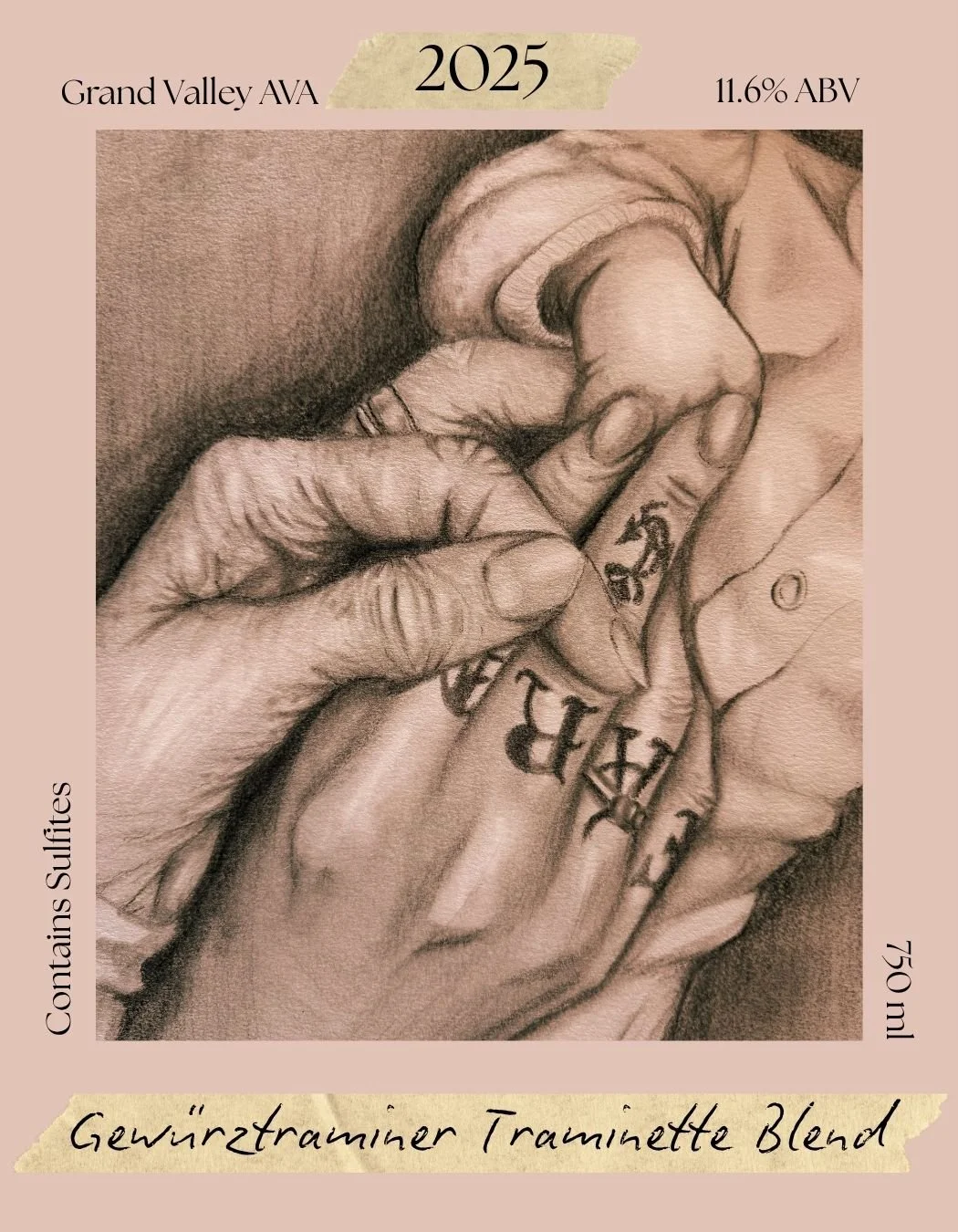
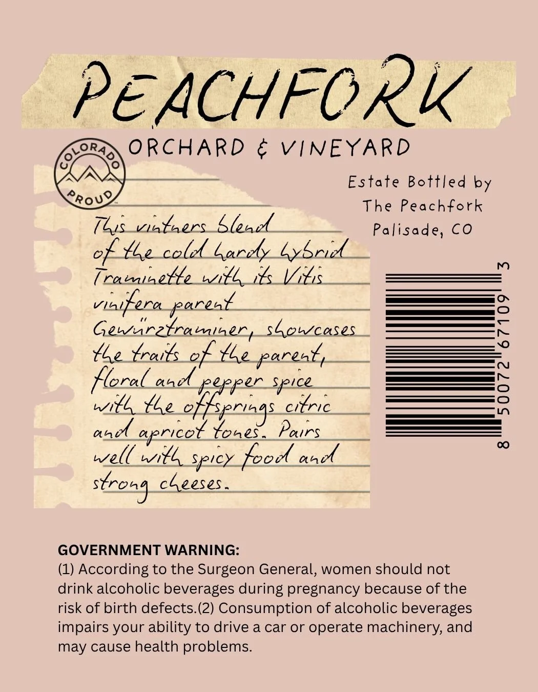

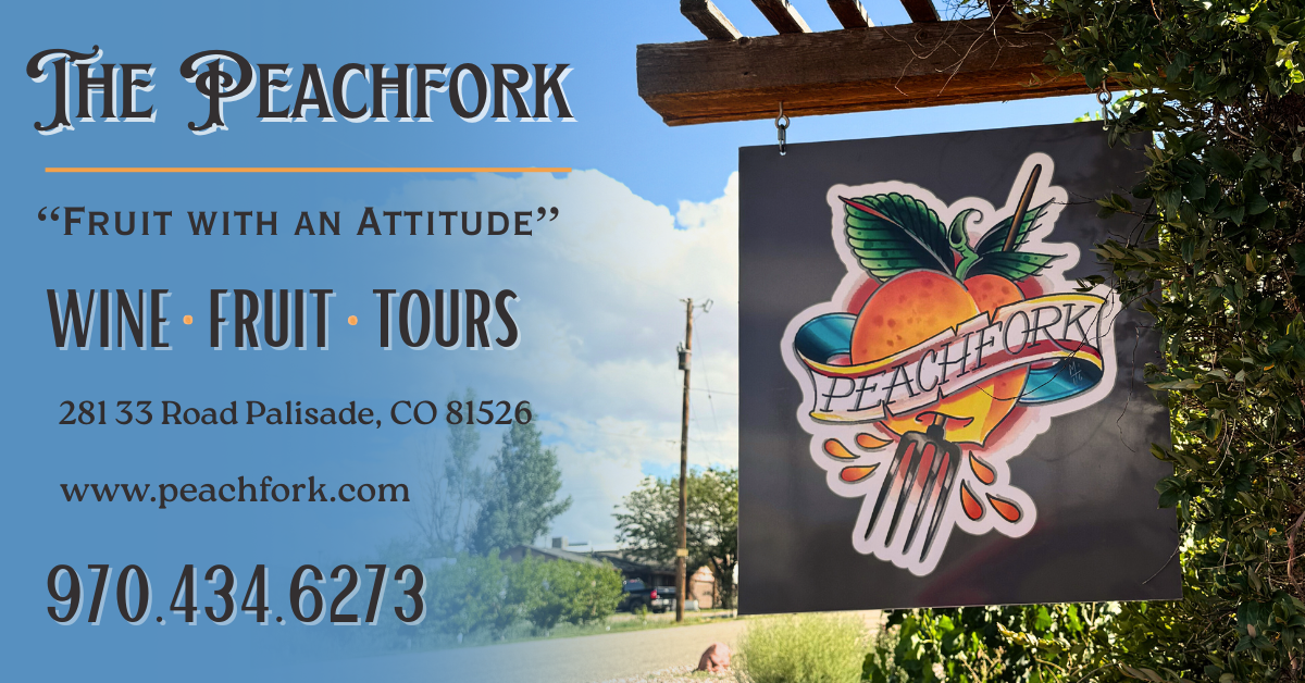
Below is not a label but an advertisement for newspaper and web that I designed for the winery
ISABELLA’S KITCHEN & GRAYHAWK GOLF CLUB
LOCATED IN SCOTTSDALE, AZ
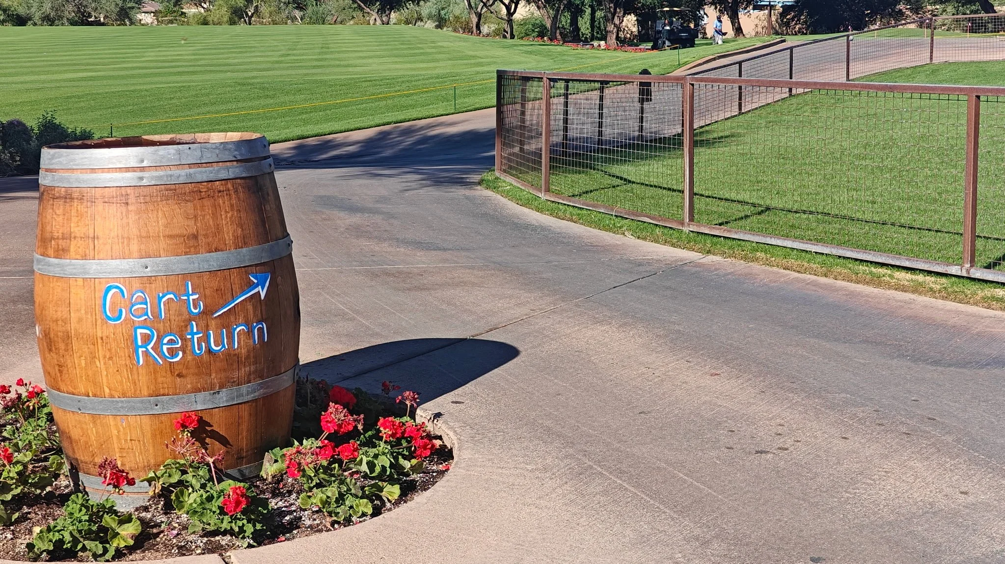
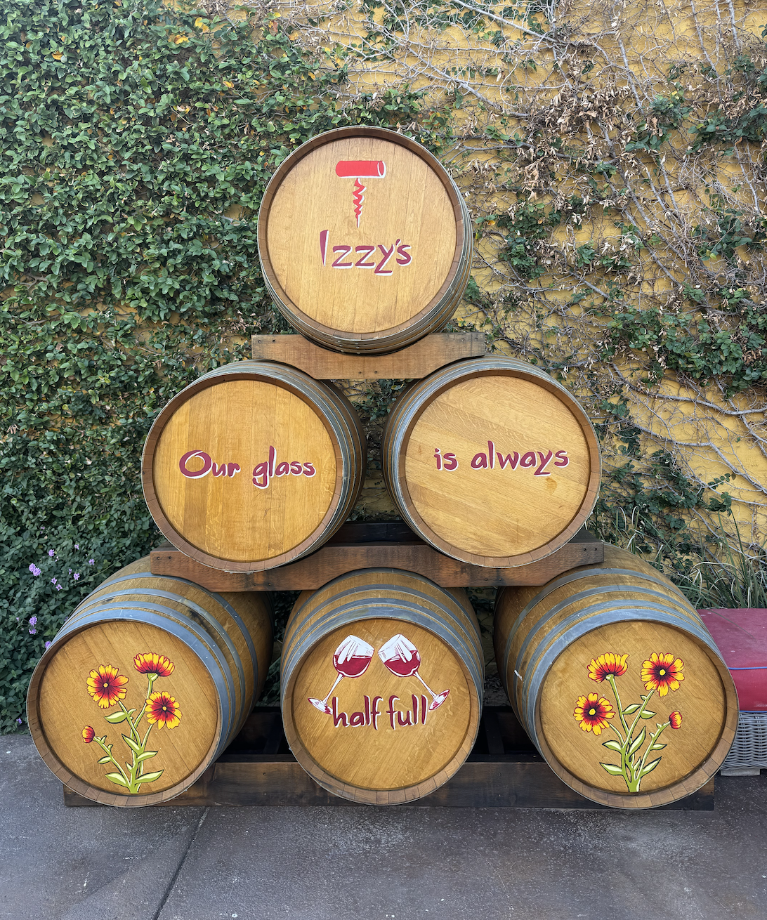
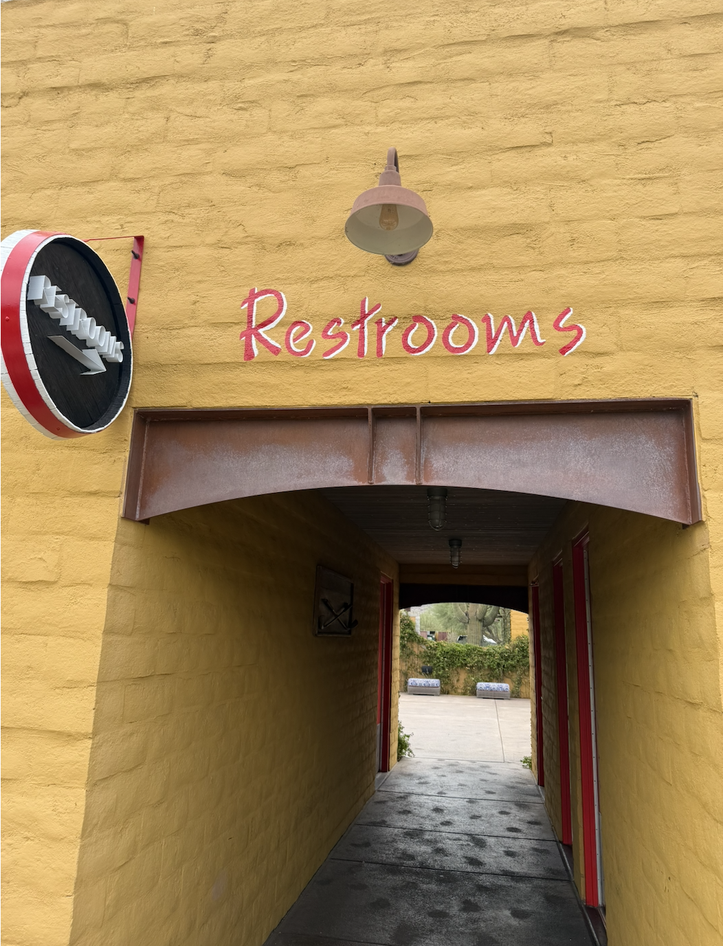
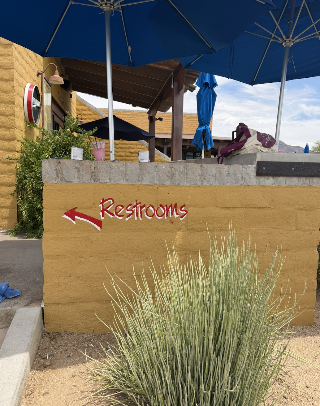
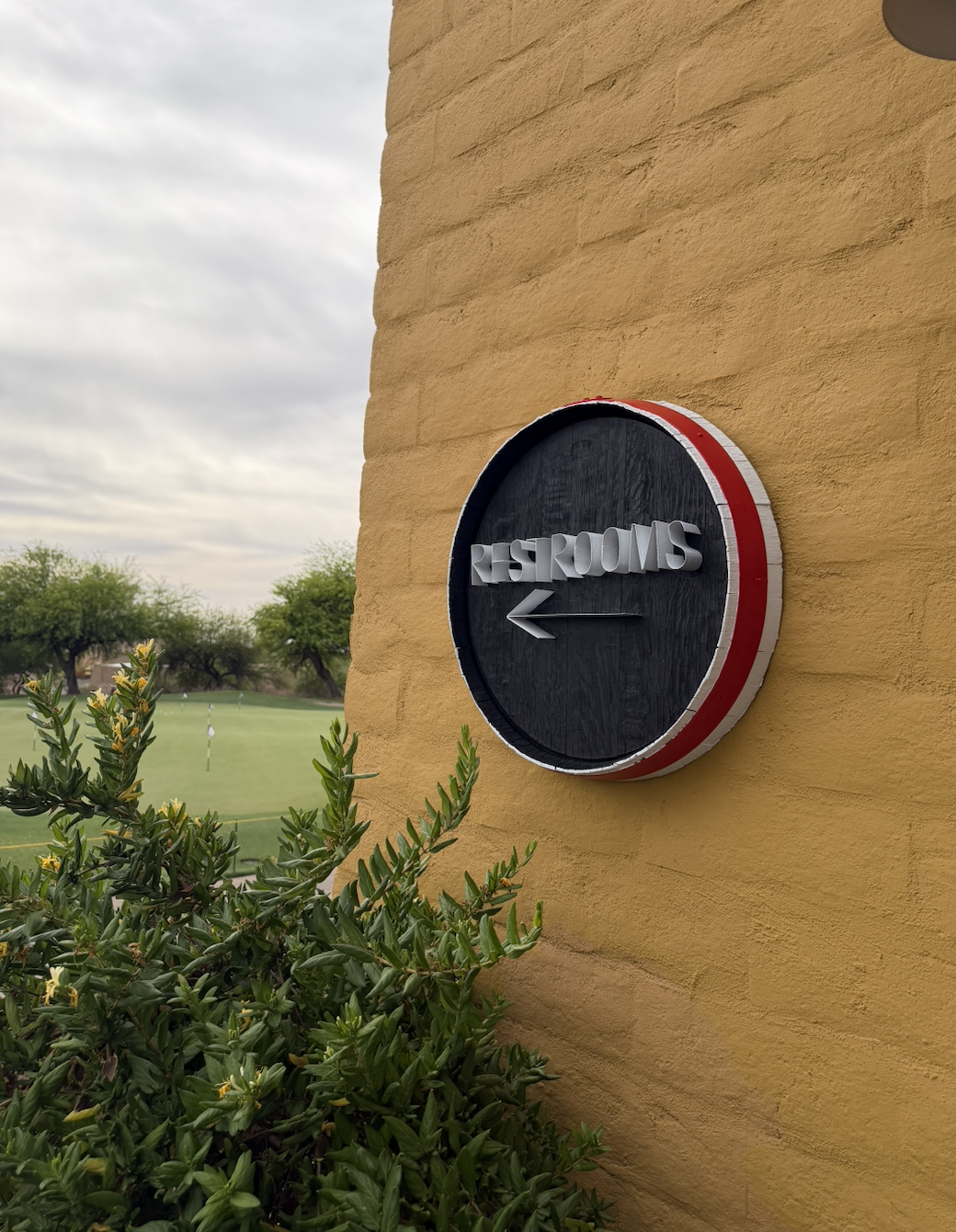
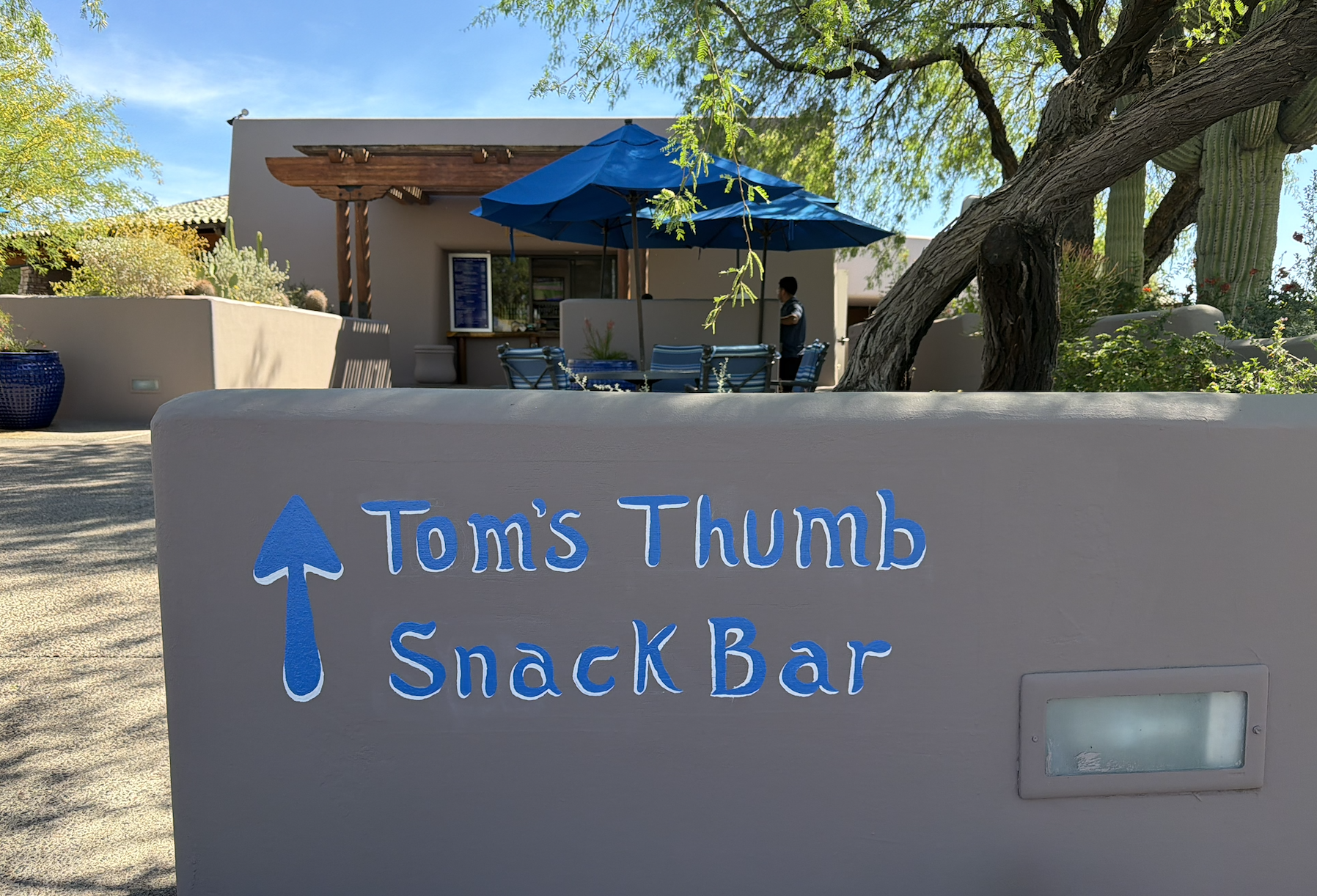
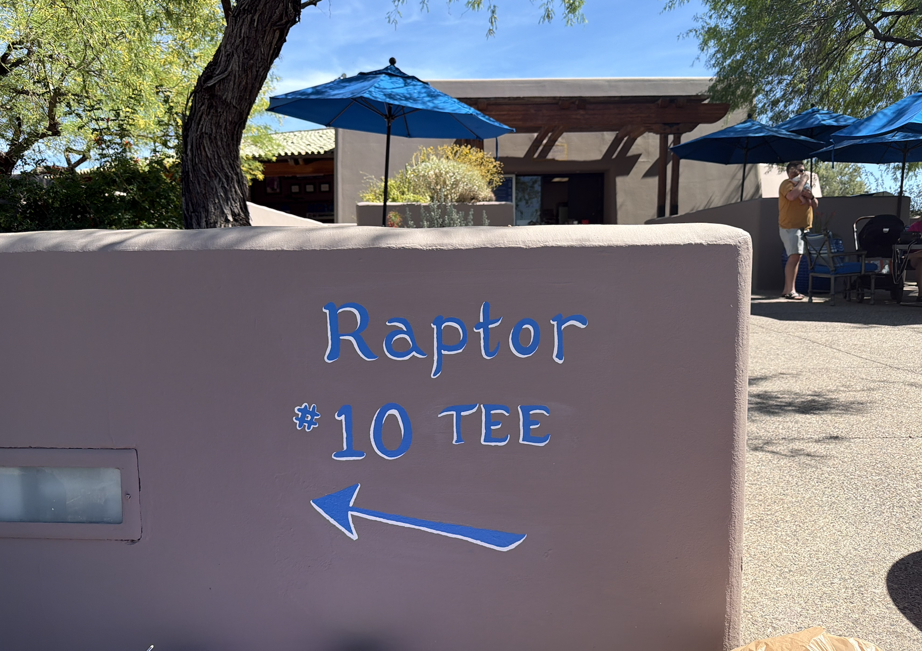
Problem: Over time, the outdoor signage at Isabella's and Grayhawk Golf Club had become faded, worn, and difficult to read due to years of exposure to the elements. In addition, certain areas of the property lacked clear directional signage, making it more difficult for patrons to navigate to key amenities such as restrooms, the snack bar, and cart rentals. The challenge was to improve visibility and wayfinding while maintaining a cohesive look that aligned with each brand's identity.
Solution: I redesigned and hand-painted a series of outdoor signs to refresh the guest experience and strengthen brand consistency throughout the property. By incorporating a carefully selected color palette and typography that reflected the character of Isabella's and Grayhawk Golf Club, I transformed outdated signage into visually engaging wayfinding tools. The updated signs provide clearer direction, improve readability from a distance, and add vibrant visual appeal while maintaining a cohesive brand presence across the property. The result is a more intuitive and welcoming experience for visitors, supported by signage that is both functional and aesthetically aligned with the brands.
Quill Creek Cafe & Phil’s Grill
Located in Grayhawk Golf Course in Scottsdale, AZ
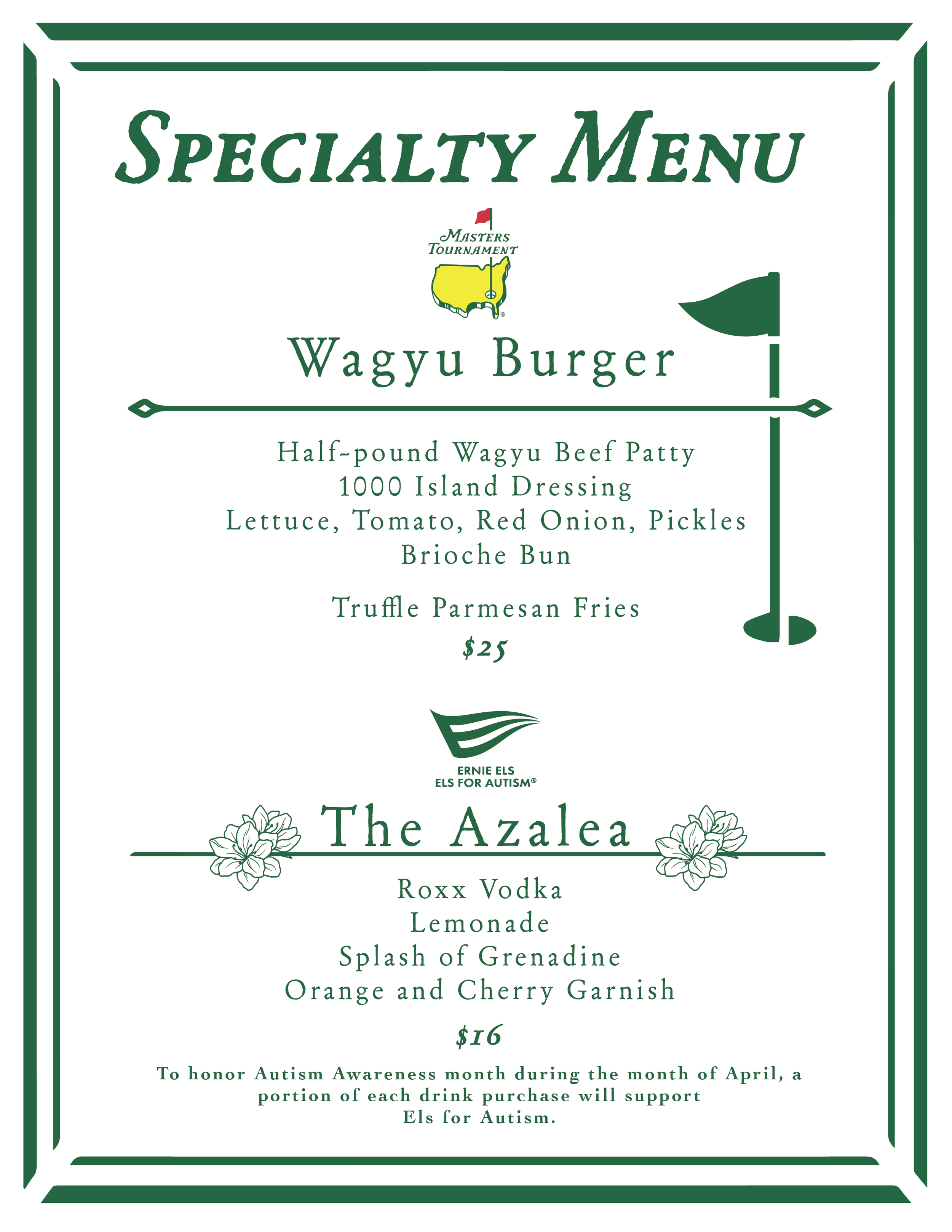
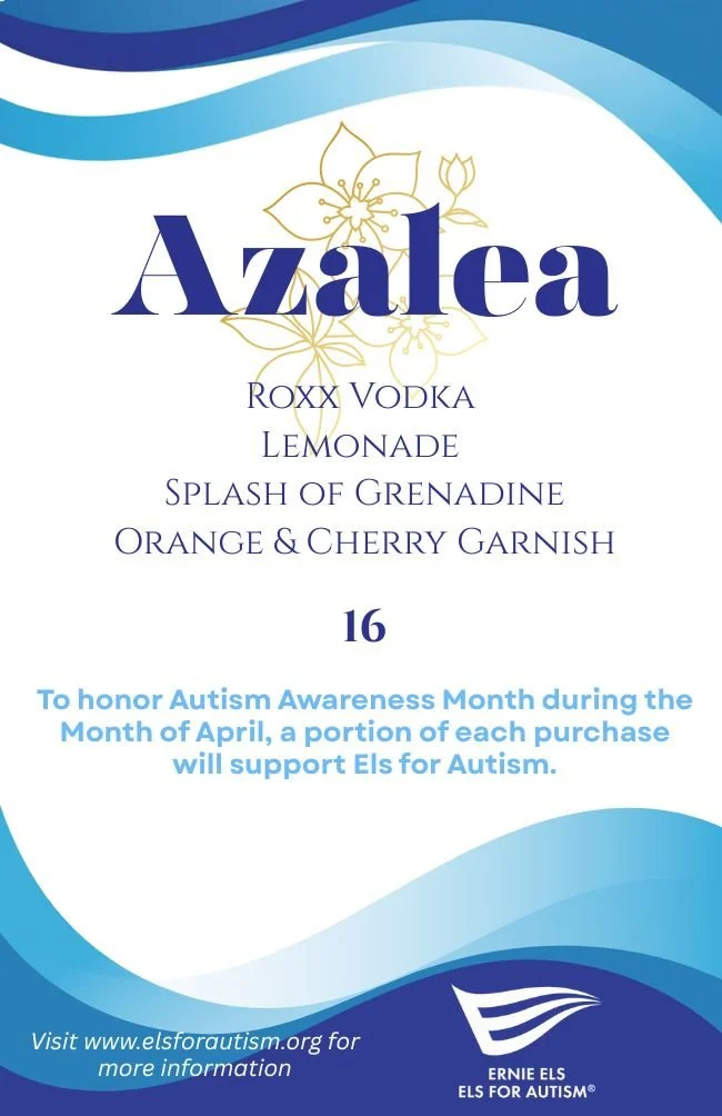
Problem: Quill Creek Café needed specialty menus that would capture guests' attention and enhance the dining experience while remaining consistent with the established Grayhawk Golf Club brand. The challenge was creating promotional materials that felt fresh and engaging without sacrificing the professionalism and visual identity guests had come to expect from the club.
Solution: I designed a series of specialty menus that balanced creativity with brand consistency, giving Quill Creek Café a unique and memorable way to showcase seasonal offerings, featured items, and special events. By incorporating thoughtful layouts, engaging visuals, and brand-aligned typography and color palettes, the menus added personality and excitement to the guest experience while maintaining a cohesive connection to Grayhawk's overall identity. The result was a collection of eye-catching marketing pieces that elevated menu presentation, encouraged customer engagement, and reinforced the club's premium brand image.





ASCO CONSTRUCTION
Located in Grand Junction, CO
Problem: ASCO Construction needed a cohesive brand identity and digital presence that would accurately reflect the quality of its work, build credibility with potential clients, and attract skilled employees. The company lacked a unified visual system across its marketing materials and needed engaging content that showcased both its craftsmanship and company culture while keeping its online presence current and informative.
Solution: I developed ASCO Construction's brand identity by designing a versatile logo system that could be seamlessly applied across web and print platforms, including merchandise, vehicle graphics, website assets, email signatures, and other branded materials. Beyond the initial branding, I continue to maintain and update the company website, ensuring content, project information, and visual assets remain current and aligned with the brand. To further strengthen ASCO's presence, I created and managed its Instagram account, capturing original photo and video content directly from active job sites. Through project showcases, employee testimonials, recruitment campaigns, and behind-the-scenes content, I highlighted ASCO's expertise, values, and workplace culture. Using a variety of creative and editing software, I transformed raw field content into polished marketing assets that increased brand visibility, built trust with potential clients, and supported the company's growth and hiring efforts.

Promo Video for the completion of the GJ Village for ASCO Construction.

Promo video for ASCO Construction's completion of A Starbucks Building in Grand Junction CO.

Instagram Reel showcasing ASCO Construction's work on Grand Junction High School.

Sky Peak Technologies
LOCATED IN GRAND JUNCTION, CO.
Problem: Sky Peak Technologies needed a clear and professional visual identity for CORA Mobile AI while also facing the challenge of communicating a complex software solution to potential customers, stakeholders, and investors. The technology offered powerful capabilities, but its value proposition needed to be presented in a way that was easy to understand and visually engaging during presentations and business discussions.
Solution: I developed the logo and visual identity for CORA Mobile AI, creating a professional brand presence that could be applied consistently across marketing and presentation materials. To support product communication, I designed a custom infographic that translated the software's features, functionality, and benefits into a clear, visually compelling narrative. By simplifying complex information into an easy-to-digest format, the infographic became an effective tool for presentations to shareholders and prospective customers, helping Sky Peak Technologies communicate the value of its technology with greater clarity, confidence, and impact.


RIET & ASSOCIATES
LOCATED IN SCOTTSDALE, AZ
I was lucky enough to design a logo for Reit & Associates insurance company. Up next is creating signage for the building as well as creating more of a brand.

PAST WORKS
VARIOUS COMPANIES AND COMMISSIONS
Creativity often lives in the details. This collection features a variety of smaller projects that allowed me to explore different styles, solve unique design challenges, and bring ideas to life through thoughtful visual communication. Though smaller in scope, each project reflects my commitment to creating engaging, purposeful design.
EVAPORATION KING LLC
Problem: Evaporation King LLC needed a creative way to promote and differentiate its new irrigation system, the Gladiator 120, while creating a memorable visual asset that would resonate with customers and strengthen product recognition.
Solution: I designed a custom gladiator character inspired by the Gladiator 120, transforming a technical product into a recognizable brand mascot. The character was developed to embody the product's strength, durability, and reliability while providing Evaporation King with a unique visual element that could be used across marketing materials, promotional content, merchandise, and future branding initiatives. By giving the product a distinct personality, the design helps increase brand recall and creates a more engaging connection with customers.
J-Money Hunts
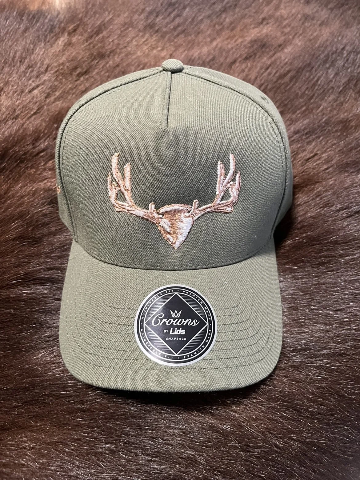
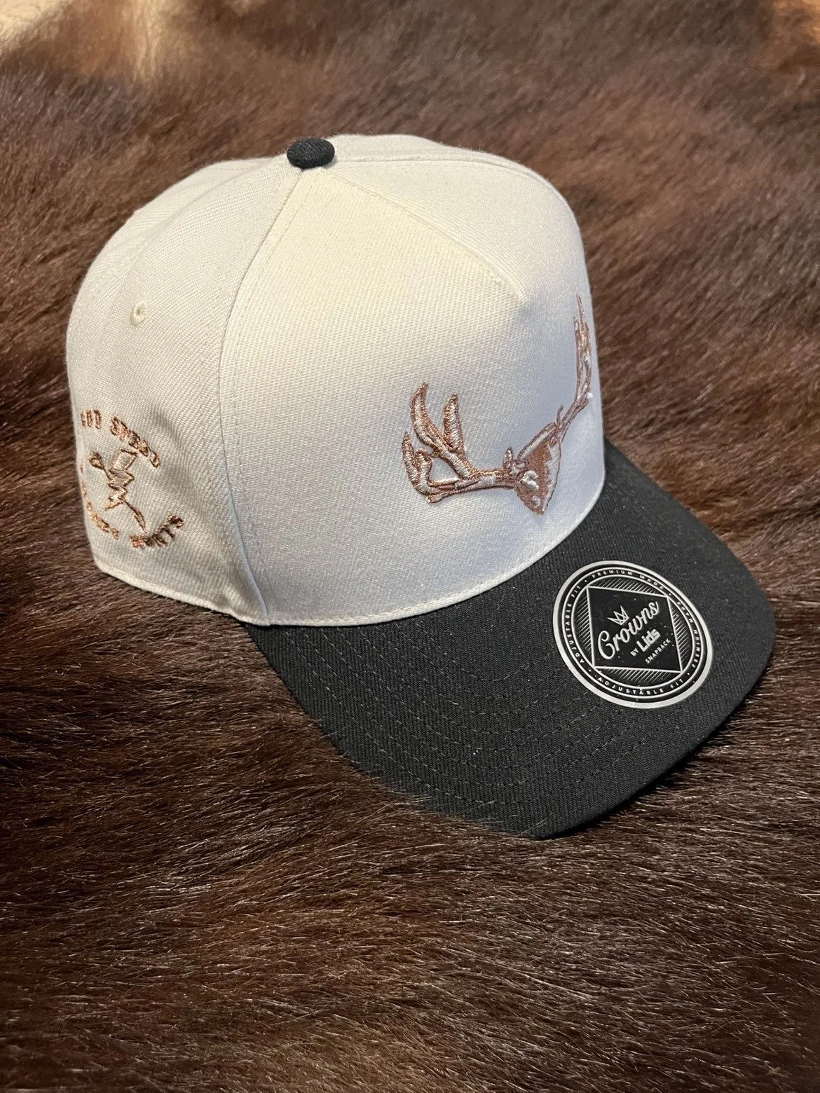
Problem: As a new hunting guide service entering the market, J-Money Hunts needed a distinctive brand identity that would appeal to outdoor enthusiasts and help establish credibility with potential clients.
Solution: I created a custom logo and branded hat designs inspired by Colorado's hunting culture and the adventurous spirit of the business. The identity was designed to be both memorable and versatile, providing a strong foundation for merchandise, marketing materials, and future brand growth while helping the business connect with its target audience.
REIT & ASSOCIATES
Problem: Reit & Associates needed a professional brand identity that would establish credibility, communicate trust, and create a strong first impression for prospective clients in the insurance industry.
Solution: I designed a custom logo that reflects the professionalism, reliability, and integrity at the core of the Reit & Associates brand. The identity was created to provide a polished and recognizable visual presence that can be applied consistently across digital and print materials, helping the company build trust with clients and strengthen its position within a competitive market.

TNT FOOD TRUCK
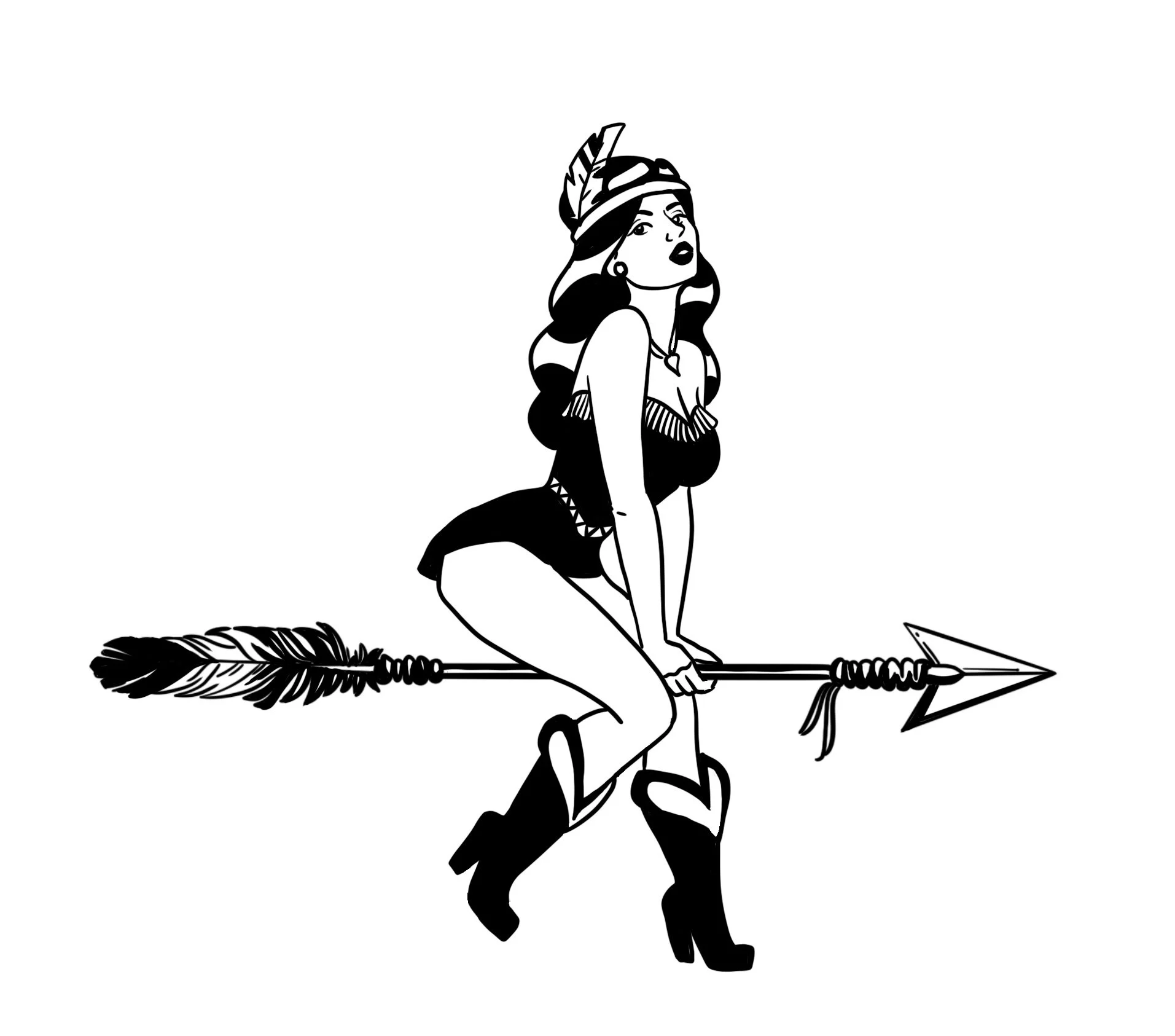
Problem: TNT Food Truck wanted to add a more personal and memorable element to its brand identity that would help distinguish the business from competitors and create a stronger connection with customers.
Solution: I created custom illustrated characters based on the food truck's owners, reimagining them in a playful 1950s retro diner waitress style. By incorporating the personalities behind the business into the branding, the artwork added a unique, approachable, and nostalgic touch that reflects the food truck's character and customer experience. The custom illustrations help make the brand more recognizable, memorable, and engaging while giving customers a visual connection to the people behind the business.